Revenue Insights Dashboard
The Revenue Insights Dashboard in Alguna provides an at-a-glance overview of your key financial metrics, including total revenue, recurring and non-recurring revenue, and detailed invoice information. This guide explains each section of the dashboard and how to interpret the data.Total Revenue Overview
At the top of the dashboard, you will find key revenue metrics: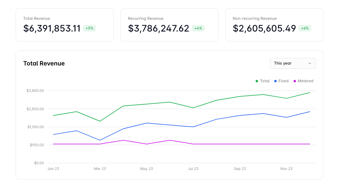
- Total Revenue: Displays the total combined revenue (both recurring and non-recurring) over the selected period. The percentage increase or decrease compared to the previous period is also shown (e.g., +5%).
- Recurring Revenue: Shows the revenue generated from recurring sources such as subscription-based services. A green arrow indicates growth, while a red arrow signals a decrease (e.g., +4%).
- Non-recurring Revenue: Reflects revenue from one-time or non-recurring services such as one-off purchases. Any percentage change from the previous period is also displayed (e.g., +6%).
- Total: The green line shows overall revenue trends.
- Fixed: The blue line shows revenue from fixed services or products.
- Metered: The purple line tracks revenue from metered products or services, which are billed based on usage.
Invoices Overview
Total Invoiced
This section displays the total amount invoiced during the selected period, breaking it down into: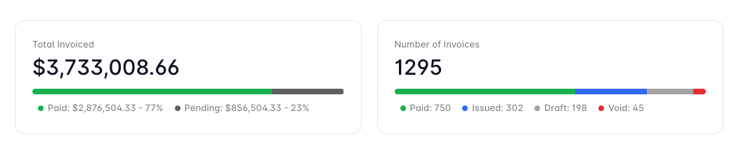
- Paid: The portion of the invoiced total that has been paid (e.g., 77%).
- Pending: The outstanding or unpaid portion of invoiced revenue (e.g., 23%).
- Total Invoiced: The grand total invoiced over the selected time period (e.g., $3,733,008.66).
Invoice Breakdown by Status
Here, you can see a breakdown of your invoices during the selected period, grouped by status:- Paid: The number of invoices that have been fully paid (e.g., 750).
- Issued: Invoices that have been sent to customers but are not yet paid (e.g., 302).
- Draft: Invoices that are still being prepared (e.g., 198).
- Void: Invoices that have been canceled or voided (e.g., 45).
Top Customers
This section highlights your top customers based on total revenue. It lists customers in descending order and provides a breakdown of their contributions to your total revenue, along with percentage changes from the previous period. The pie chart visually represents the distribution of revenue across all customers.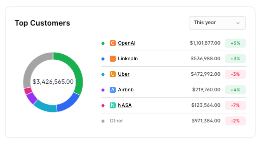
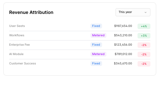
Revenue Attribution
This section breaks down revenue by different product categories or services, allowing you to see how each product type contributes to the overall revenue in the format of:- Product Name
- Product Type (whether it is fixed or metered)
- Earnings
- Growth